Tuesday, 17 June 2014

Off the page and over the garden wall.


In celebration of the blooming abundance of June. 


As usual this has morphed from one idea to another. I'd planned to do yellow flowers as well  and maybe some blue and then there was a wall  and then it started to looked like a climbing rose so I held off with the yellow. I also had to stop myself with the leaf stamps. Do you think I stopped in time?
I think it looks a little twee but maybe that is OK. I hope you can see I chopped 2cm off the side of the card so the stamping goes onto the inside as well. It wasn't easy to get a good photo.
I made this to enter the Less is More One Layer challenge - Off the Edge
                                                                  We'd love you to display our banner


I also found this site STAMPlorations by following a link from someone else. I don't remember who now:                                                         
https://blogger.googleusercontent.com/img/b/R29vZ2xl/AVvXsEhJ9XzS4UwAG4jExpDu6mOBgFQVZ6SHhbXhpvYH07cX7uKbpAVWdps9hymasd0bR3sTbchBms8OCNntJESSH1B4Sdi9bMUbLGMkPz350DYwqppz2Wl5dj5e4PirpkX6S-bkM3CwWt6Noqo/s1600/june2014challenge.jpg

Stamps use are: Leaves and flowers - Kanban
                           Crackle - Kaisercraft
                           Sentiment - Hobbycraft
Adirondak inks: Meadow, Latte and Cranberry plus some Stickles for the flower centres.
                                                                

Thursday, 5 June 2014

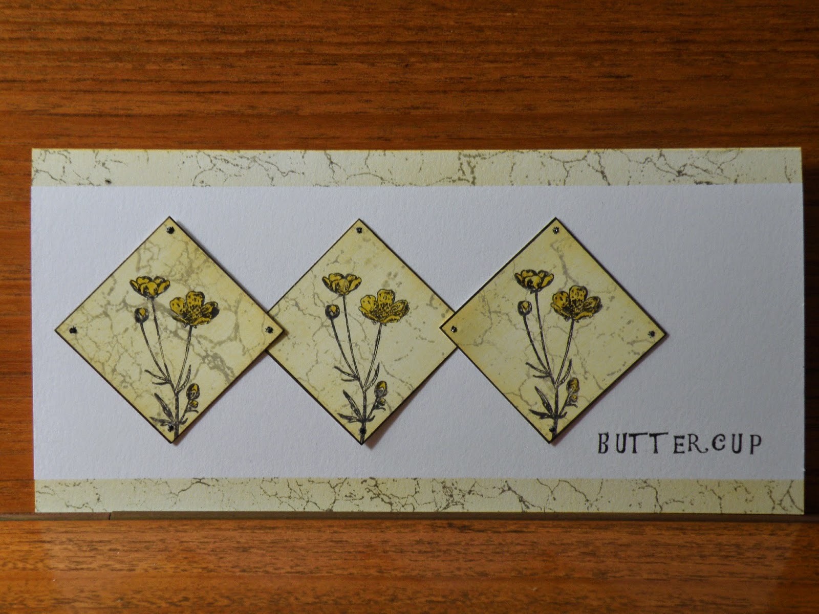
Buttercups


These cards have been in very many incarnations before their final glueing down.
I finished up with two cards as the diamonds were supposed to go on the diamond background but didn't really work.However I like this one and love the buttercup background on the second card.
It was also very difficult to get the colours right on the photograph. This is a bit more yellow than it looks here.

This is the third attempt at this one. The colour is creamy really.  And I smudged the stickles trying to take the photograph before dinner. Should know better. I know to leave things to dry. I've fixed it now and made some inserts with just an edge of yellow and crackle glaze as in the first card but haven't managed to photograph those yet.
                                                               I thought I'd enter:
                                                https://blogger.googleusercontent.com/img/b/R29vZ2xl/AVvXsEgl9xm1cPP1ID8RV60Ra9FlGuG7pnV8yvDtgMa4fk1HqkNzjCLiKCRotieJjqcMXfIZVkJ9pGZgnj_v-q2FQBrbin74Nzf18IwkVPIaMEHnS3q1TTeFf3btVHGodVPky3gqXTUal5B689Vu/s1600/11.jpg
                                                                    Clean and simple , I think
                                                    and     
                                 Less is More - More than one stamp.
We'd love you to display our banner 
                                                        
I never need much invitation to use lots of stamps but I have been quite restrained here.
Stamps: Kaisercraft - crackle glaze - my current favourite.
               Inkylicious - buttercup
               Dovecraft - letters.
Ink: Adirondak - sunshine, pitch black and slate. 
Black and yellow Pro-markers.  
Thanks for looking. 


Saturday, 31 May 2014

Solid wood - part two.

I made a few changes to this design. I have made a new insert which slides more easily and therefore doesn't catch on the nail. This on is glued on a little lower anyway. Then I shaped another cut out so a note or vouchers can be inserted. I put some tape two thirds of the way along the inside of the insert so the money doesn't disappear inside and finish up in the recycling.

Saturday, 24 May 2014

Solid wood- part one.

I struggle with cards for men and boys as do many of us. I have several nephews and usually resort to buying cards which is disappointing. I don't have many stamps that would appeal to men - I'm not very sure what would anyway...
So this is what I have been doing today (wet day, no gardening).


I've really enjoyed playing with this even though no flowers, ribbon or embossing powder was involved.  I designed it for the challenge at The Male Room - A Moving Part. I hope this counts as a moving part. I've been looking at this site hoping for ideas. 
Also entered into Cardz4Guyz - Action /Movement. Sorry my picture is too small. 
Recently I saw a card made with a wood effect stamp. I have banned myself from buying any new stamps for a while (paper, ink, gems, glue, ribbon, pens also) but then while looking for inspiration I found a tutorial about how to make a wood effect with an ink pad. You just slide the pad across the card and then draw on lines for planks. There are no knot holes so I may have to add the wood effect stamp to my wish list.
I had some input from male members of my family and I am quite pleased with the result though it needs a little tweaking. The insert is quite tight but all glued down so too late to  reduce and the nail catches a little as you slide it back in. Also the bit of tag showing should probably have something on it or be tucked away completely.
I'd like to try again and make a pocket to insert cash, after all that is what I usually give. The boys are all teenage and upwards and presents are even harder than cards.
Let me know what you think. 

Thursday, 22 May 2014

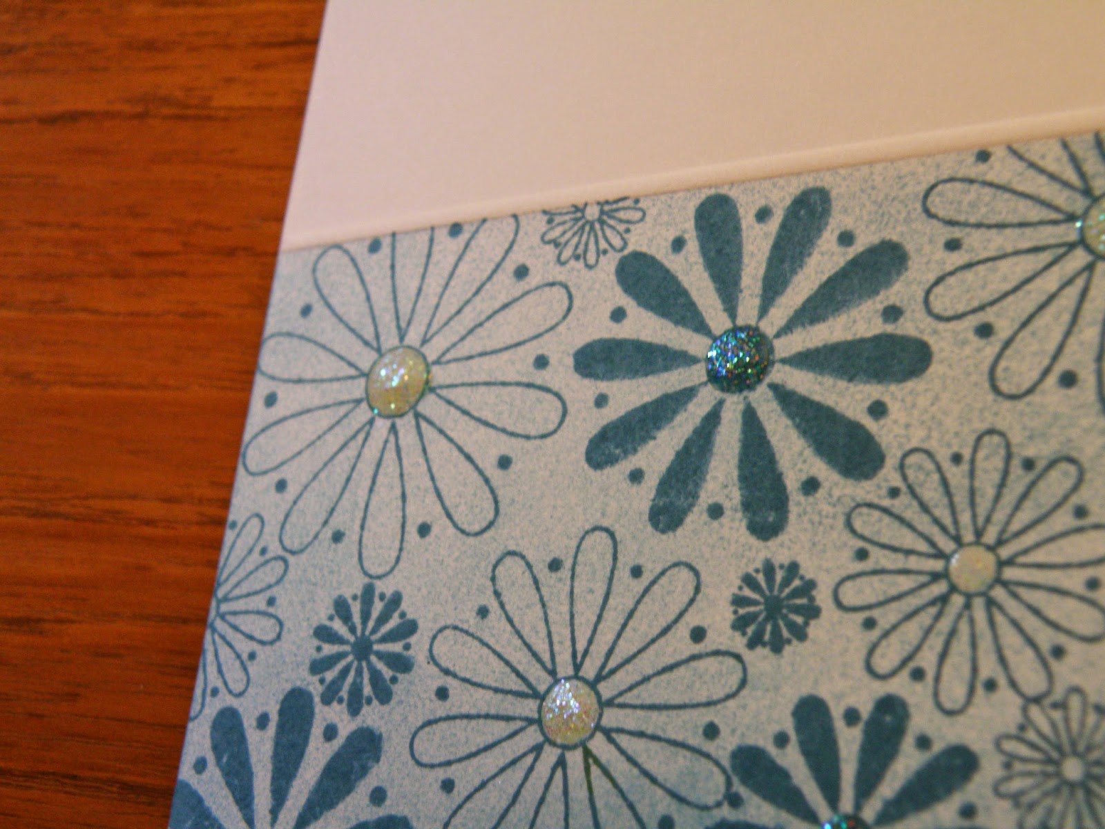
Turquoise flowers and glitter

I started this card under the impression that I had gems the same colour as this ink. I made the card, got out the gems and they were a completely different colour and I wanted it tone on tone.
So I filled in with some Glossy Accents and then went over the top with some glitter as well...
I'm entering into the Less is More challenge - Flowers and also The Paper Players - Clean and Simple 'Floral', which I just found.
I love flowers and flowery cards but they are not right for everyone. I hope here the colours and style make it subtle and not full on flowery so suitable for your more down to earth friends.Still a bit of sparkle though.
Memento Teal ink and Paula Pascual stamps.

Thursday, 8 May 2014

Cherry blossom

I saw some wonderful pictures of cherry blossom in Japan (the pictures were in Japan, I wasn't) and they inspired this card. I hope it looks like a Japanese screen or painting. (I know I'm dreaming).
 The colours are Adirondaks Mountain Rose, Meadow and Latte and some gold pen, which I think ( I hope) counts as brown, so fits the Three Colours or Three shades of one colour at Less is More this week.
 I made this card first and stamped and embossed the words directly onto the card and then wasn't happy so added the tag on top. I still don't think it is quite right.  However the background is a little paler which I think is good. I'd appreciate any tips on adding sentiments as I don't think I'm very good at it and often don't write anything at all on the front of a card.
I gave it to my Mum and Dad for their 52nd wedding anniversary and, needless to say, they liked it! Let me know what you think. I've still got a lot to learn. 

Sunday, 27 April 2014

Small is beautiful

Yesterday I tried to make a thank-you card which ended up in the bin. This sketchfrom Less is More though, lent itself beautifully to something sweet and pretty. It's such a simple idea but could be interpreted in so many ways as will, no doubt, be demonstrated over the next week. 
I used a mish mash of stamps from various sets and was very pleased that they all worked together. 

I think it  would work as a Christmas wreath which I intend to try out. I've interpreted it very literally but I think bows and Holly or mistletoe would work. I really shouldn't be thinking about the Winter Festival in spring.
The stamps were from Kanban, Inkadinkado, Hobby Art, Majestix and Kaiser craft.